Gorge Washington Magazine
Featuring in-depth stories, gorgeous photography, and exciting videos, Gorge Washington Magazine is an interactive publication bringing its readers the Columbia River Gorge like never seen before. Collaborating with the publisher, I created a logo, business cards, and a promotional postcard.

Logo
The magazine's aim is to showcase the local scene in the Columbia River Gorge, so the logo needed to resonate with locals, and tourists alike. After researching the area in the initial stages of the project, it became clear that Beacon Rock is an important, and recognizable local landmark.
The huge monolith stands tall in the landscape with its unique shape, and it was this very shape that became the foundation for the identity. FF Meta was chosen as the logo typeface for its ability to perform well at small sizes.


Business Cards
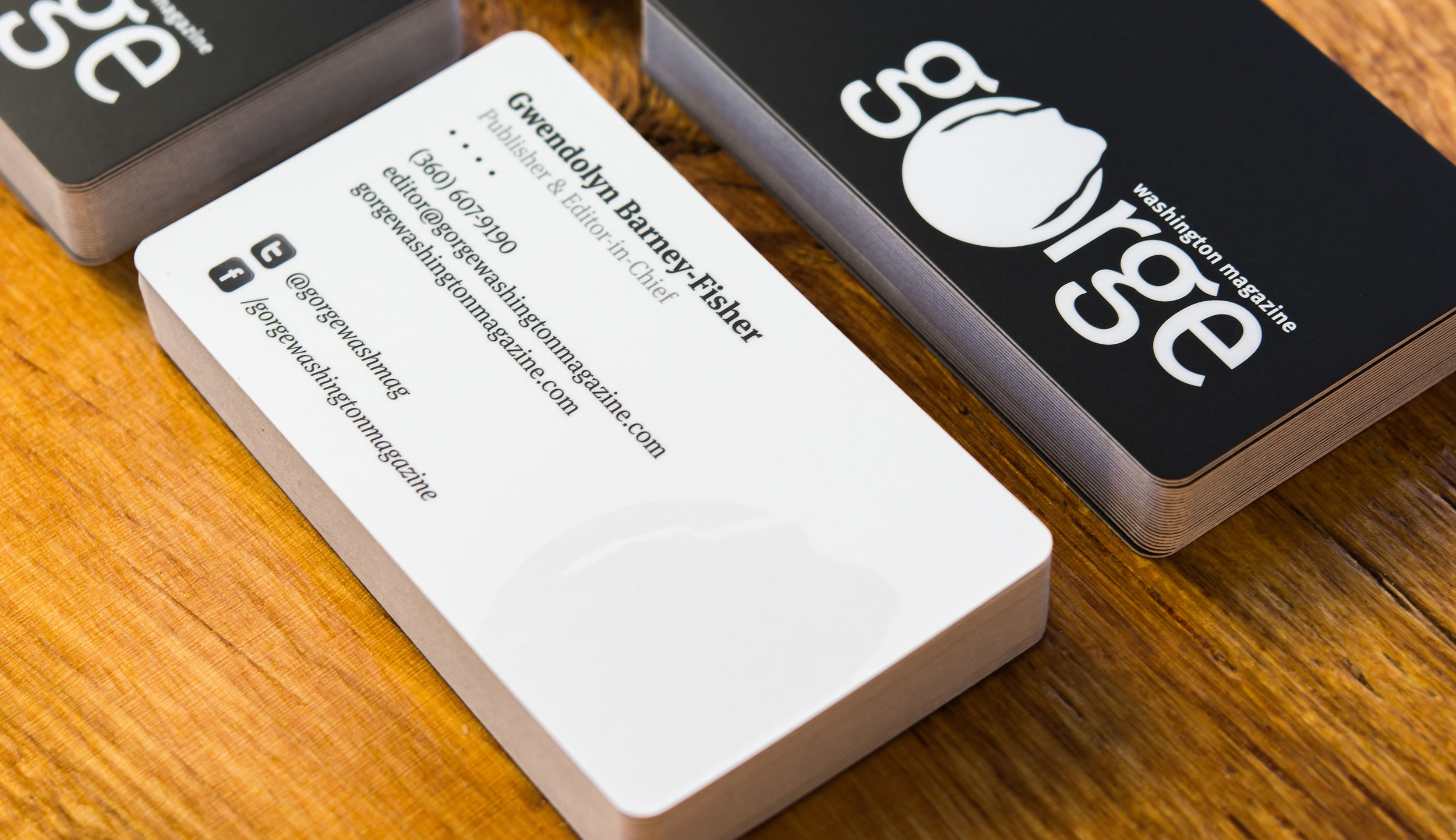
I decided upon a minimalist approach when working on the business cards. The color palette consists of black, white, and gray.
FF Meta Serif became the typeface of choice for the body copy, as it contrasts nicely with the logo, and salutes the magazine's editorial roots. As a nice finishing touch, the Beacon Rock icon was printed using spot UV gloss.


Postcards
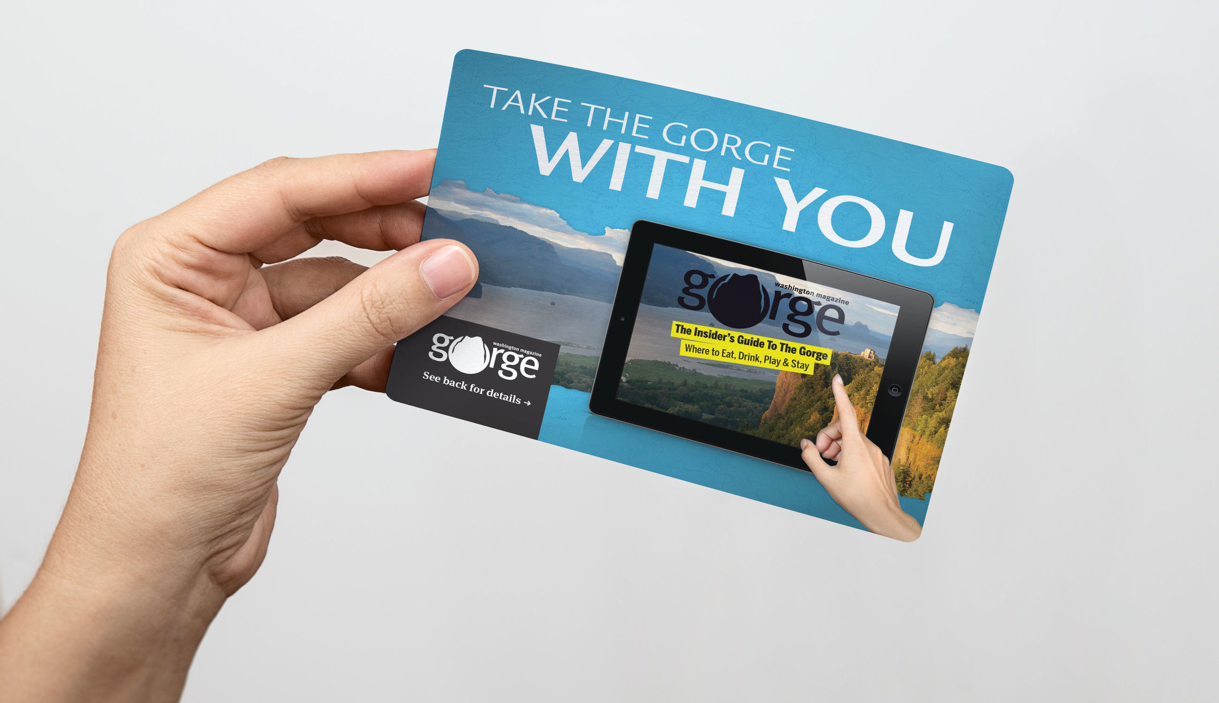
The promotional postcards' purpose was to create interest in the magazine, and drive readers to download the app. These were designed to stand out from the crowd, be informative, and give potential users a taste of what they can find inside the publication.


